UI/UX laws

Hi, i am a post graduate (MCA) student and a open source contributor.
Why UI/UX laws important ❗
Whether you are a UX designer or a product maker, you should know basic UX laws. These UX principles help to guide product design because they show the insights behind users' expectations, not only that this laws provide general guidelines to help UX designers for process and developing better user experiences.Therefore, following them is necessary with the aim to create rewarding designs.
The UI/UX laws 🔰
User Experience is an umbrella term that covers visual design, information architecture, usability, interaction design and user research; it covers all the aspects which users have with the product. If we go deeper into UX then we find some psychological laws that result in a great experience for the users. This article will focus on the 21 important laws on UI/UX
Fitts’s Law
-Large enough for users to select it easily -Separate from other elements in the interface (larger in size and differently colored, for instance) -Clickable anywhere so it’s easy to carry out the action and -Within a users’ reach so they have to do minimal work -For example, floating social media sharing options are typically within a site visitors’ reach—encouraging them to share content. Another way to make sure the target is easy to acquire: arrange the action item(s) in a pie menu. Here, choices are presented at an equal distance in a circle—in sharp contrast with a navigation bar where the travel distance is longer.
Jakob’s Law
This law was defined by the director of the Nielsen Norman Group, Jakob Nielsen, who insists you design for familiarity.
Since the best designs are user-centric, it helps to leverage prevailing mental models or to create designs that meet users’ expectations. For instance, users expect to find the ‘shopping bag’ on an ecommerce site in the navigation bar.

Pareto Principle
80% of the results come from 20% of the work.
The Pareto Principle is a pretty prominent one across several industries—not just the design field. You’ll find it highly valuable for projects with limited resources or tight timelines.
Law of Similarity
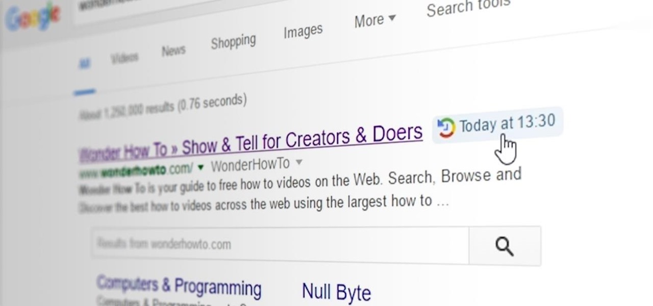
This means consumers perceive visually similar elements in a design such as those sharing the same color, size, shape, orientation, and movement as related in meaning or functionality. This is why clicked links have a different color in contrast with those that aren’t. Google’s purple color for a link you’ve visited is a prime example:
Law of Proximity
this law is also a grouping principle that makes it easy for users to interact with your design. And, like the law above, it means that users perceive elements that are near each other or arranged close together in a series to be linked.
Peak-End Rule
If you think of a project you enjoyed working on recently, you’ll note that you can recall some intense moments that you enjoyed and the final moments when you wrapped it up.
Postel’s Law
Postel’s law also goes by the name of the robustness principle. And it makes two points:
Take what users share with you. For example, if you ask a user to share their country and they enter ‘US’ instead of ‘United States,’ accept it and convert the data for consistency yourself.

Aesthetic-Usability Effect
In fact, scientists analyzed the impact of visual appeal on site usability and learned that the visual appeal of a design influences first impressions the most. Test participants gave high interest and usability ratings to websites that looked visually stunning and low interest and ratings to sites with low visual appeal.
Doherty Threshold
The Doherty Threshold is all about your design’s timely reaction. The idea is to hold your audience’s attention by making them feel they’re in charge of the interaction. Think of it like this: when people see a response to each of their clicks, they’re likely to feel in charge of the interaction, which helps them stick with using the interface.
A good rule of thumb is to display a response within one second of the user action to encourage navigation. If you go any slower, you risk losing users as they feel that the design isn’t responding and it’s holding them back. Even if the process takes long, ensure the design engages users in the meantime. Progress bars and animations can help by telling users there’s work going on in the background.
Hick’s Law
If you’ve ever given up on taking a course because the option list was too long, you know what Hick’s Law or Hick-Hyman Law (based on the psychologists duo, William Edmund Hick and Ray Hyman who created this law) is.
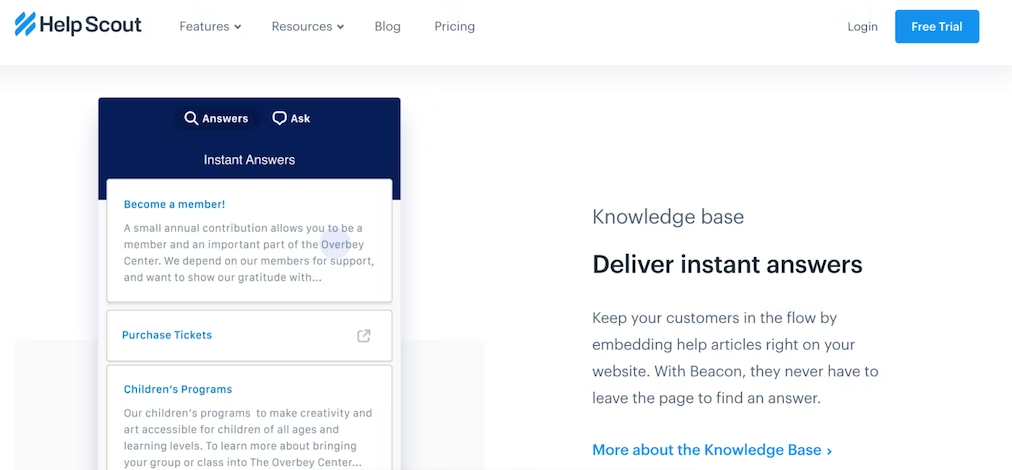
Essentially, too many choices lead to choice or analysis paralysis, i.e., information overload preventing users from taking any action at all. So limit available options. HelpScout’s navigation bar design, for instance, only includes essential categories:
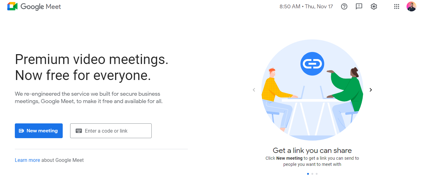
Miller’s Law
Since people can hold seven items in their working memory at most, aim to reduce their cognitive load or the mental effort it takes to remember everything to make a decision.
Some ways to do so:
-Minimize choices as Hick’s Law states -Design based on learning models to reduce learning load (circle back to Jacob’s Law for this) -Keep your design clutter-free so there are fewer design elements vying for users’ attention
Google Meet’s design follows these principles—clutter-free design with minimal choices.
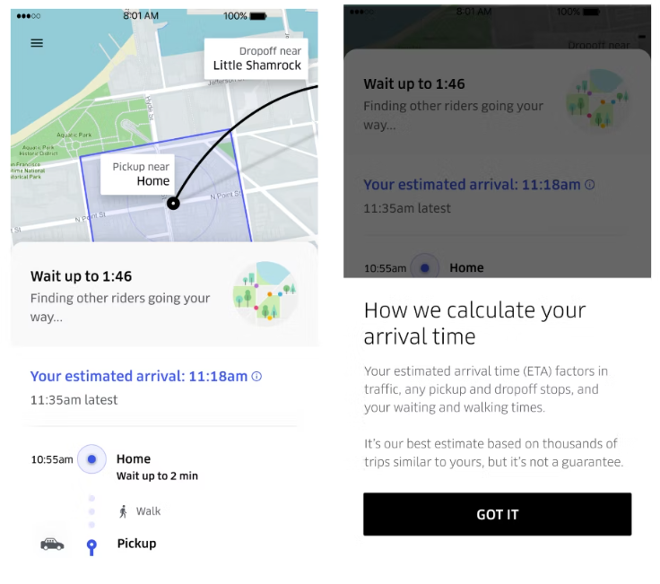
Goal-gradient effect
Case in point: Dropbox’s onboarding process. It uses a checklist to tell users how much of the job is complete, therefore, leveraging the goal-gradient effect to encourage them to complete the onboarding process.
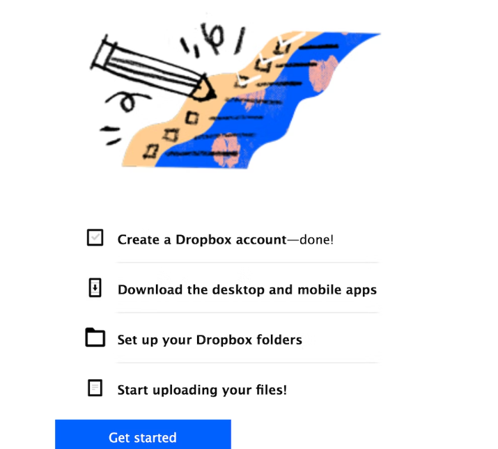
For designers, this means it’s essential to provide a visual representation of the progress made or highlight the remaining steps to motivate users. Uber’s UX is another fitting example. The app tells users their wait time to keep them glued to their goal:
Law of Common Region
When users visit a design, they make quick judgments based on grouped elements in a target area to understand which UI areas to interact with.
Shading a group of elements, adding a background color, or designating elements in the header, footer, and navigation panel are some ways to create common regions for interactive designs.

Law of Uniform Connectedness
This one’s another grouping principle. According to it, users see grouped-together elements as connected. Again, this means you use visual direction to group elements that are linked to meet your audience’s expectations.
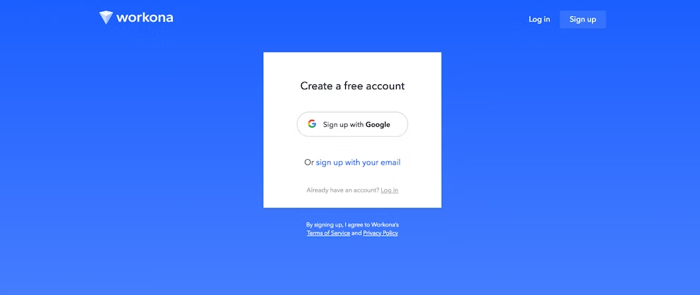
For instance, use the same shapes, frame, or color to unite related elements. This log in screen from Workona shares linked elements related to signing in in a white-colored box:
Law of Prägnanz
In simple words, your audience will always find simplicity in complex or ambiguous designs to save themselves from the mental overload. It’s why call to action (CTA) buttons tend to be rectangles rather than hexagons or any other complex structure.
Occam’s Razor
Occam’s Razor comes in handy when you’re choosing between design prototypes. The goal is to select the design that’s simplest among all the options.

Parkinson’s Law:
Parkinson’s Law is also widely known in other fields, particularly, among productivity enthusiasts. For UX-ers, this law means you should limit the time it takes to complete a task to what users expect it’ll take.
Let’s say, users expect to fill in forms within three minutes (the exact expectation varies on the task at hand though. You can identify it using usability tests that show users completing the task in question). Anything shortening this duration works as a positive experience.
Serial Position Effect
The Serial Position Effect suggests you position the most important UX elements on the far left and right of the design to improve memorization. On the other hand, place the least important elements in the middle.
Studies explain why this is essential. For one, multiple eye-tracking studies highlight that viewers consume online content in a zigzag layout, lawn-mower pattern, or an F, for instance. In all cases, they observe the extremes, which means placing important information in those areas brings the information to users’ attention.
Tesler’s Law
Tesler’s Law or the Law of Conservation of Complexity states that there’s a certain amount of complication that’s intrinsic to every system.
Admittedly, each design has a certain level of complexity to it. Your responsibility is to reduce the complexity as much as possible. By doing so, you can help users focus on the task at hand instead of figuring out how to navigate the design.
Von Restorff Effect
Hedwig von Restorff, the psychiatrist behind this UX law, made a simple observation: package information you want to attract attention to in a visually distinct manner. It’s why CTA buttons tend to have different colors than the rest of the design as in this pop-up from Sleeknote.

Zeigarnik Effect
Soviet psychologist and psychiatrist, Bluma Wulfovna Zeigarnik, came up with the Zeigarnik Effect after her research on the impact of finished and unfinished tasks on memory. It turned out incomplete or interrupted tasks were easier to remember than completed tasks.
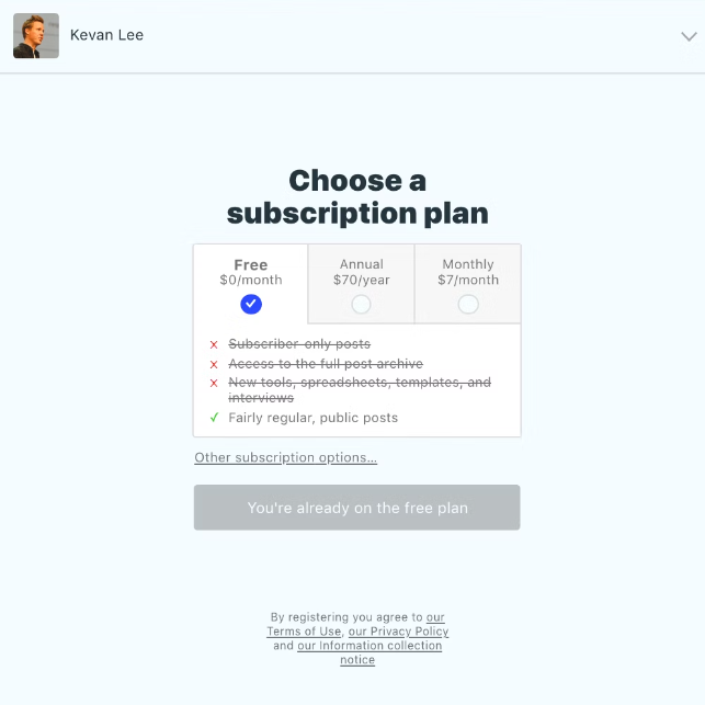
It’s why several companies leverage the Zeigarnik effect for newsletter subscriptions, for example. By dividing the process into two steps, you’re more likely to convince interested users to complete the subscription process and remember you too. Take Kevan Lee’s newsletter subscription, for example. Step 1 asks for your email address:
Resources 📚
🚩 https://youtu.be/kbZejnPXyLM
🚩 https://youtu.be/RYDiDpW2VkM
🚩 https://learnux.io/course/figma/figma-basics
🚩 https://adityamca123.hashnode.dev/learn-designing-with-uiux
That's all for this blog, I hope you will learn something new. And feel free to share your thoughts and feedback, Thanks for reading.
Feel free to reach out me 👀
Twitter 🖱
LinkedIn 🖱
Github 🖱


